0
CD: David Lang, 'note to a friend'
0
CD: David Lang, 'the sense of senses'
0
CD: David Lang, 'poor hymnal'
0
CD: Caroline Shaw, 'How to fold the wind'

0
CD: Maya Beiser, 'Salt'
0
Vinyl: Christopher Zuar, 'Exuberance'

0
CD: Jared Redmond, 'Scintillant'
0
CD: Eric Nathan, 'Some Favored Nook'
0
CD: Michael Gorden, '8'
0
Digital release: Solomon Ge, 'Threnody'
0
7" Vinyl: Michael Gordon & Kronos Quartet, 'Campaign Songs'
0
CD: Julia Wolfe, 'Anthracite Fields'
0
CD: David Lang, 'the loser'
0
CD: Michael Gordon, 'dystopia'
0
CD: Danielle Schwob, 'Out of the Tunnel'
0
CD: Eric Nathan, 'Missing Words'
0
Double LP: Terry Riley, 'Autodreamographical Tales Tales'
0
CD & Vinyl: David Lang, 'death speaks'
0
CD: David Lang, 'thorn'
0
CD & Vinyl: Chris Campbell, 'Orison'
0
CD: Michael Gordon, 'Clouded Yellow'
0
CD, Vinyl & Website: Dreamers’ Circus, 'Second Movement'
0
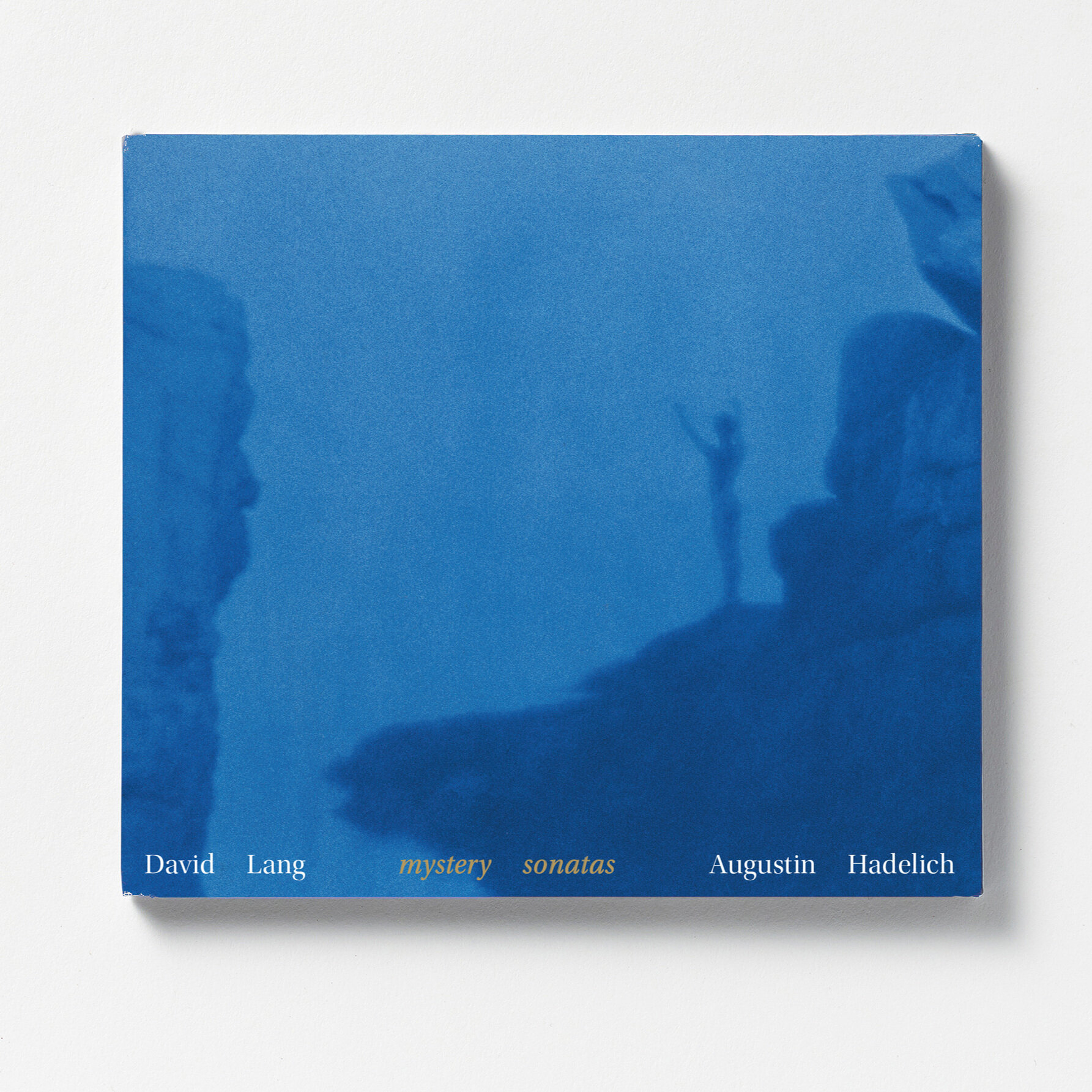
CD & Vinyl: David Lang, 'Mystery Sonatas'
0
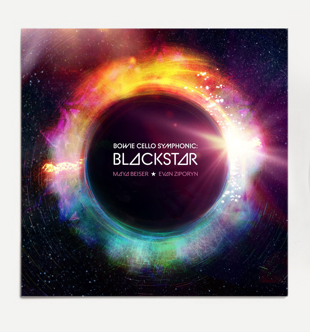
Vinyl: Maya Beiser & Evan Zipporyn, 'Blackstar'
0
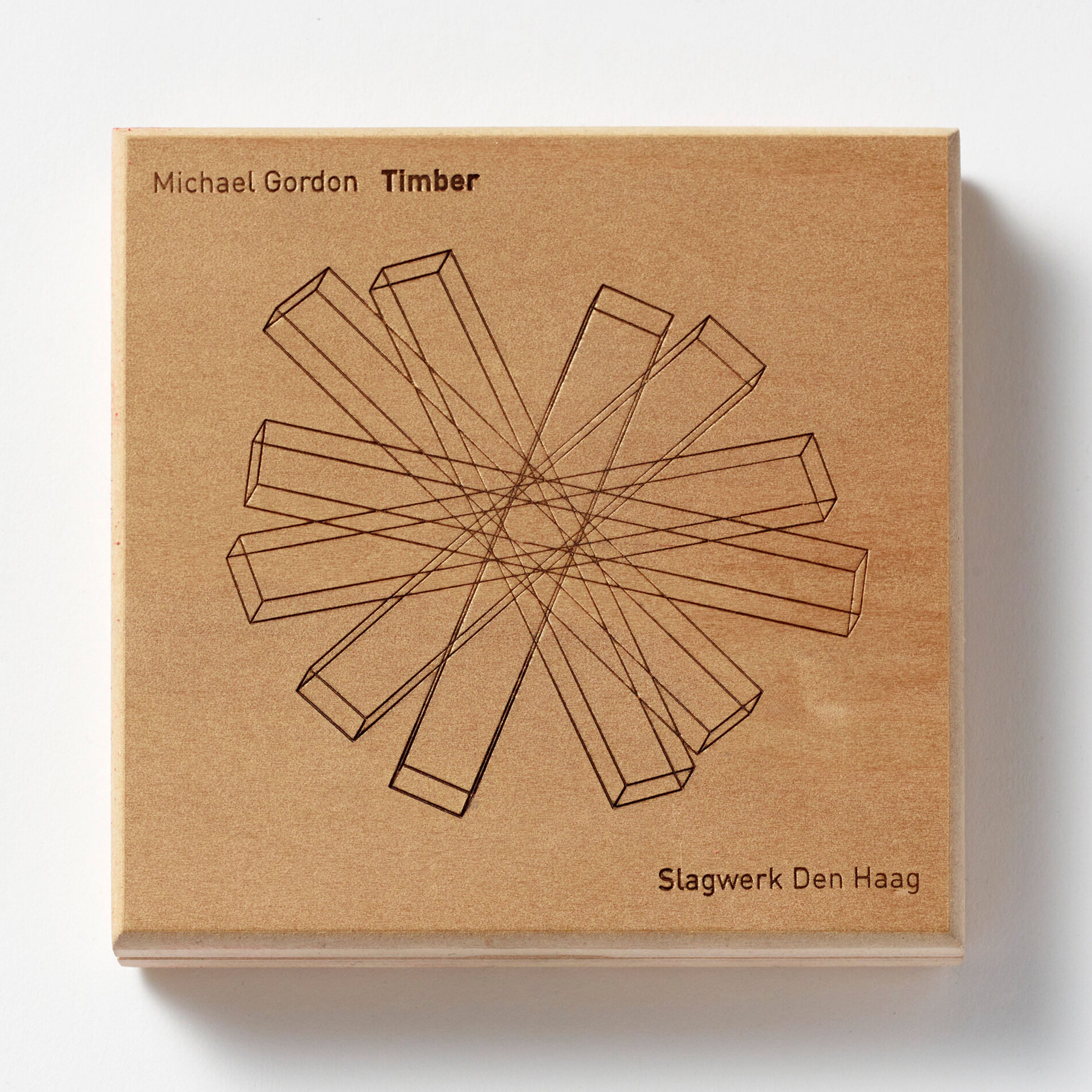
CD: Michael Gordon, 'Timber'
0
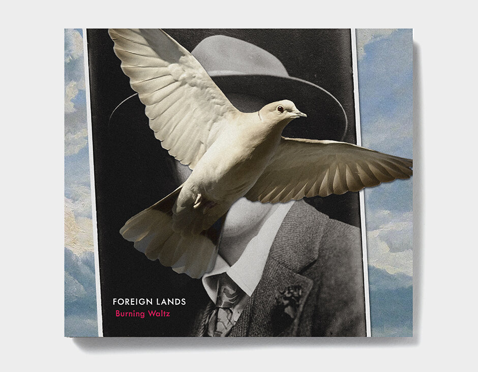
CD & Vinyl: Michael Møller & Foreign Lands, 'Burning Waltz'
0
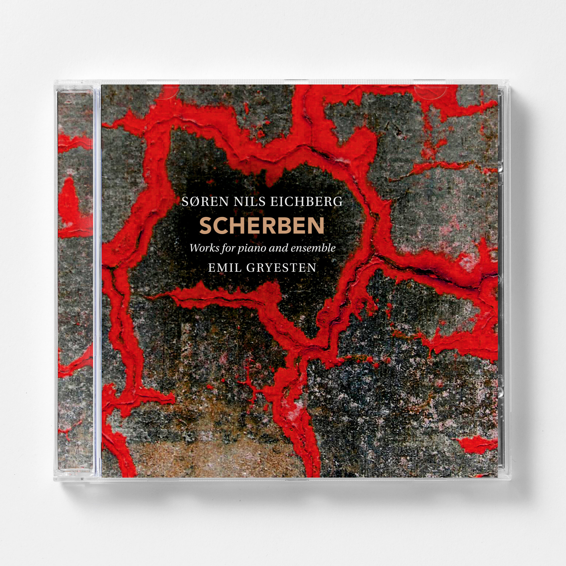
CD: Søren Eichberg – Scherben

0
CD: Bent Sørensen, 'Mignon'
0
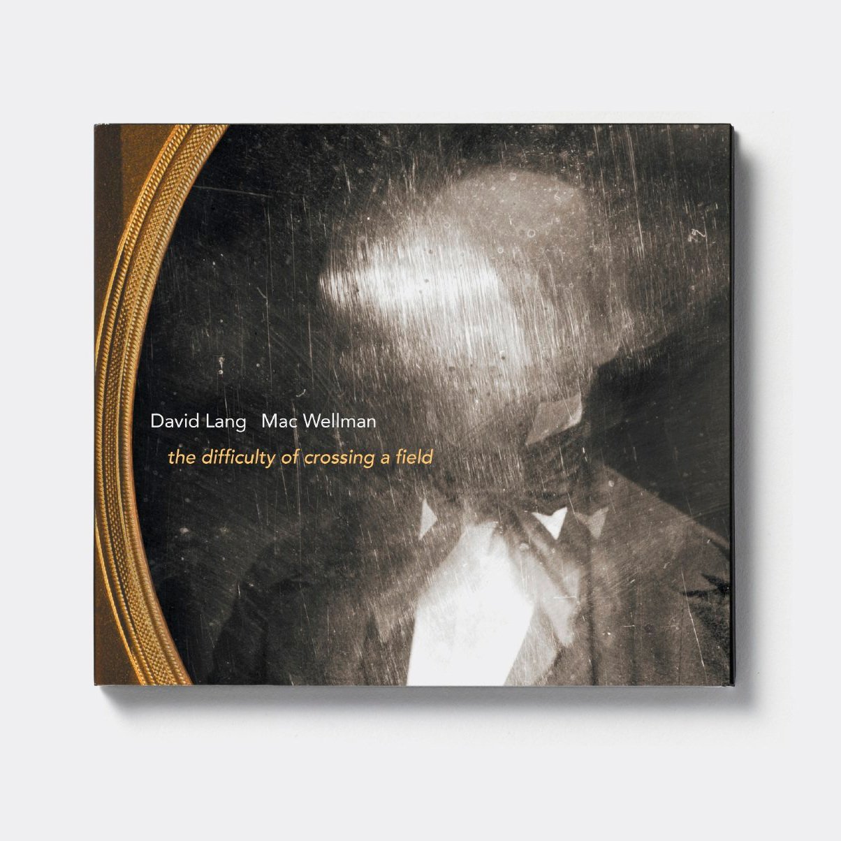
CD: David Lang, 'the difficulty of crossing a field'
0
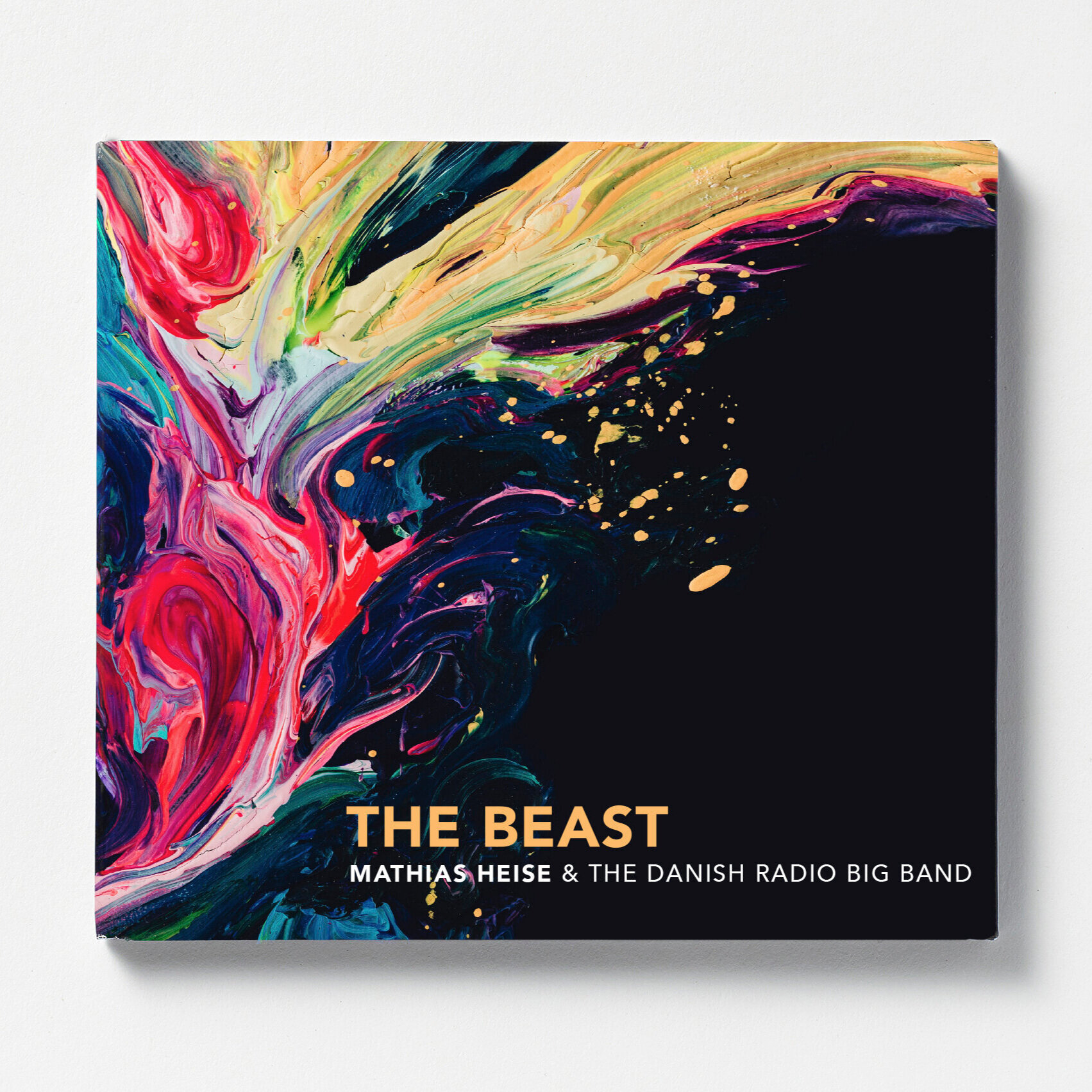
CD & Vinyl: Mathias Heise, 'The Beast'
0
CD: Jexper Holmen, 'Oort Cloud'
0
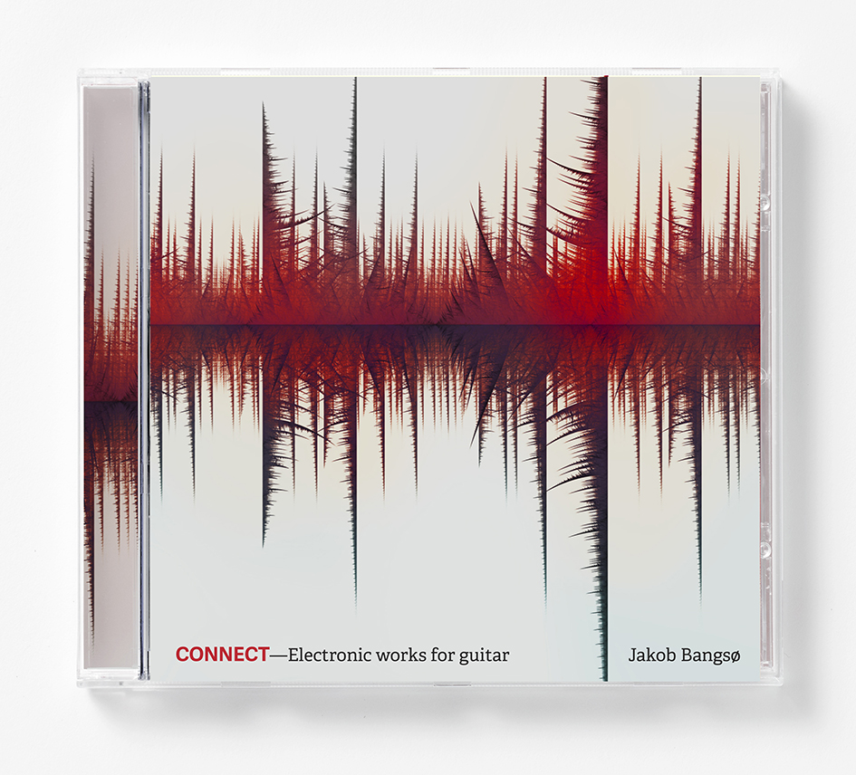
CD: Jakob Bangsøe, 'Connect'
0
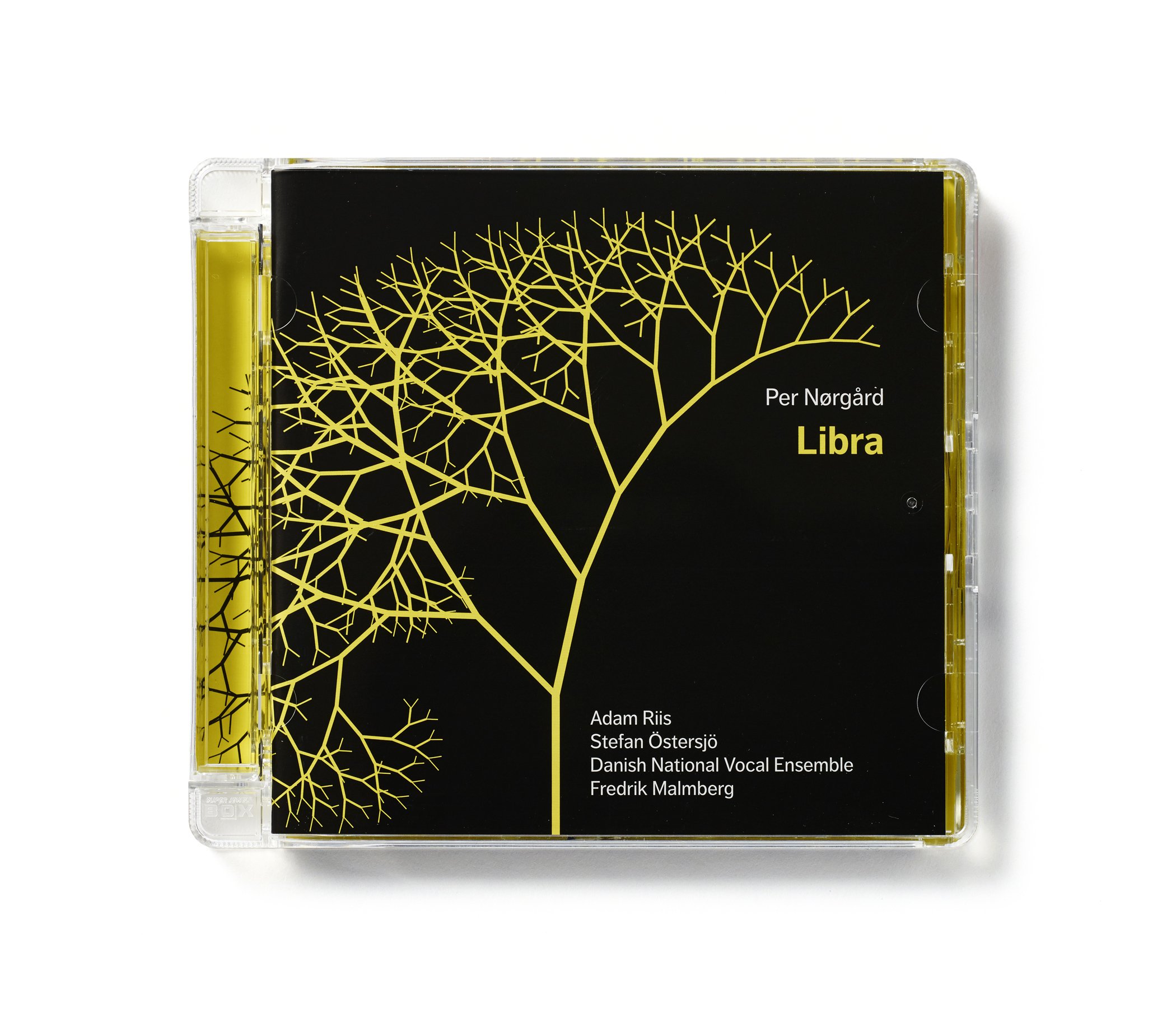
CD: Per Nørgård, 'Libra'

0
CD/BOOK: Per Nørgård, 'Titanic'
0
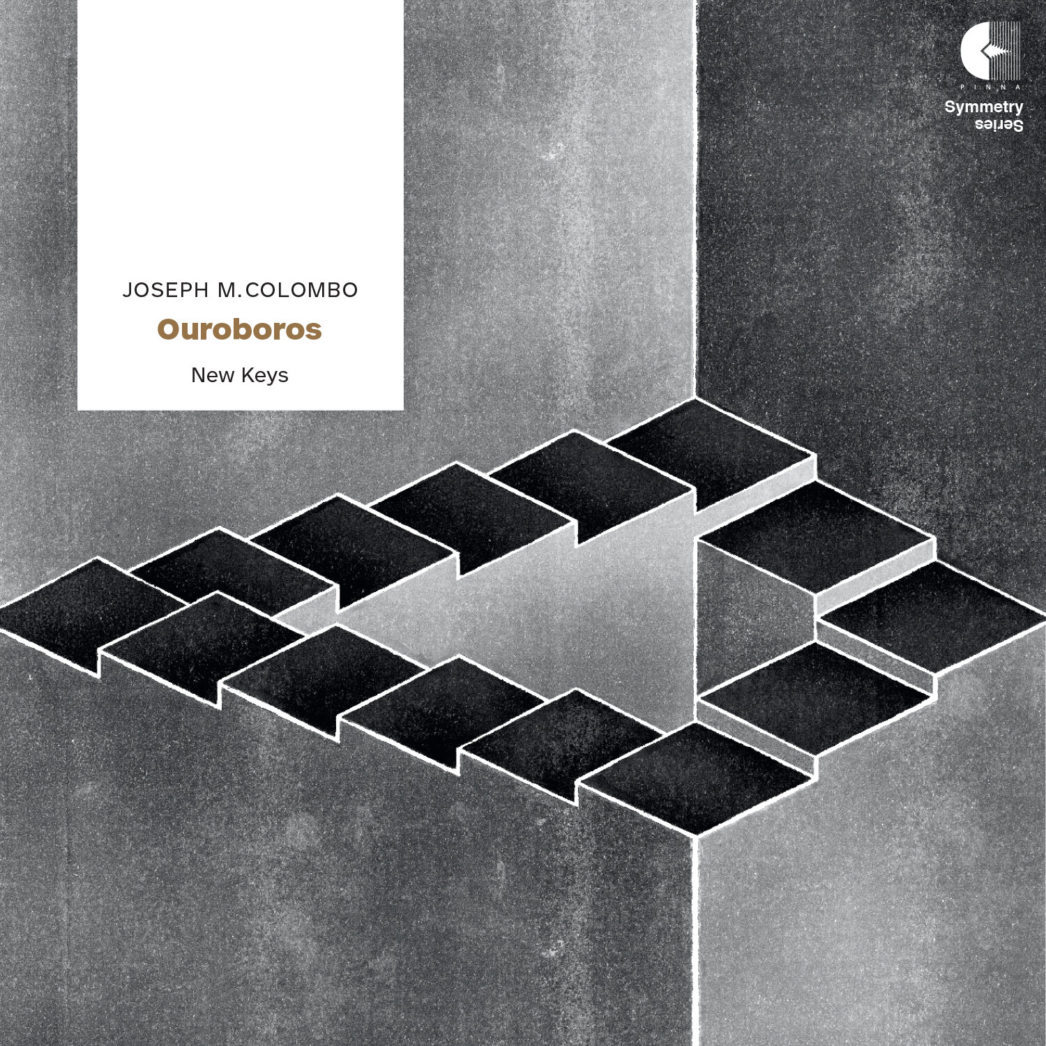
Vinyl: Joseph M Colombo, 'Ouroboros'
0
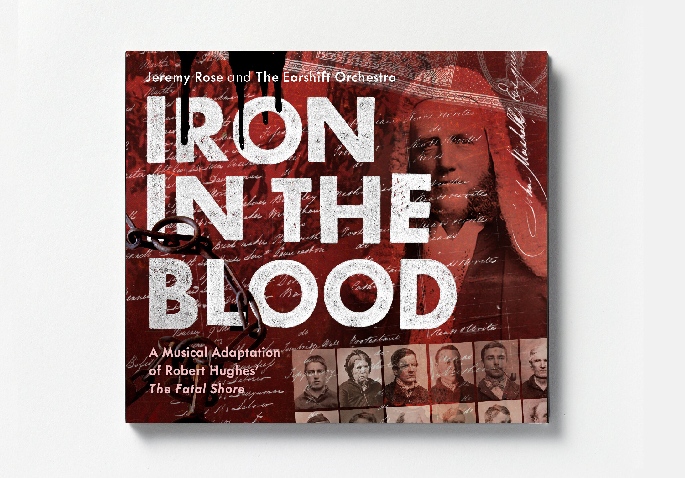
CD: Jeremy Rose, Iron in the Blood

0
CD: Pele Gudmundsen-Holmgreen, 'Complete String Quartets, vol. 1

0
CD: Pelle Gudmundsen-Holmgreen, 'Incontri'